About the Project - The Kigali Air Story
Project Overview
This dashboard analyzes air quality data from Kigali, Rwanda, focusing on PM2.5 measurements from reference monitors at the US embassy. For context, Kigali experienced low visibility and haze/smog in early January 2025, prompting interest in exploring the potential influence of particulate matter (PM) on these conditions. The data is sourced from Airnow.gov, providing valuable insights into the city's air quality patterns and trends. Unfortunately, the AirNow site showing the embassies and consulates, where I downloaded this data, shows '404 not found', with no clear timeline for when it will be back online. Fortunately, the data needed for 2022–2025 for Kigali had been downloaded beforehand.
This analysis aims to identify notable trends in air quality data from Kigali, Rwanda, with a particular focus on the period between November 2024 and January 2025. During this timeframe, a slight increase in PM2.5 levels is observed; however, further investigation is needed to determine its statistical significance and potential causes. Notably, the data indicates that Kigali’s Air Quality Index (AQI) ranges from moderate to unhealthy for most of the year, with only a few days classified as 'good,' offering a detailed perspective on the city’s air quality dynamics.
Methodology
Data is collected through reference-grade monitors maintained by the US Embassy in Kigali. The measurements undergo quality control processes before being made available through Airnow.gov's system. The data for the city of interest was downloaded as a csv for analysis.
Visual Comparison
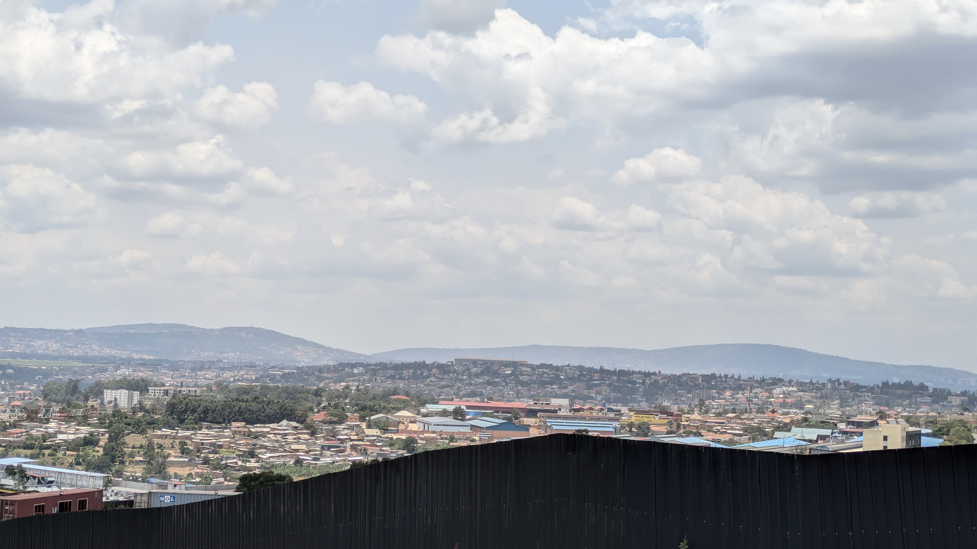
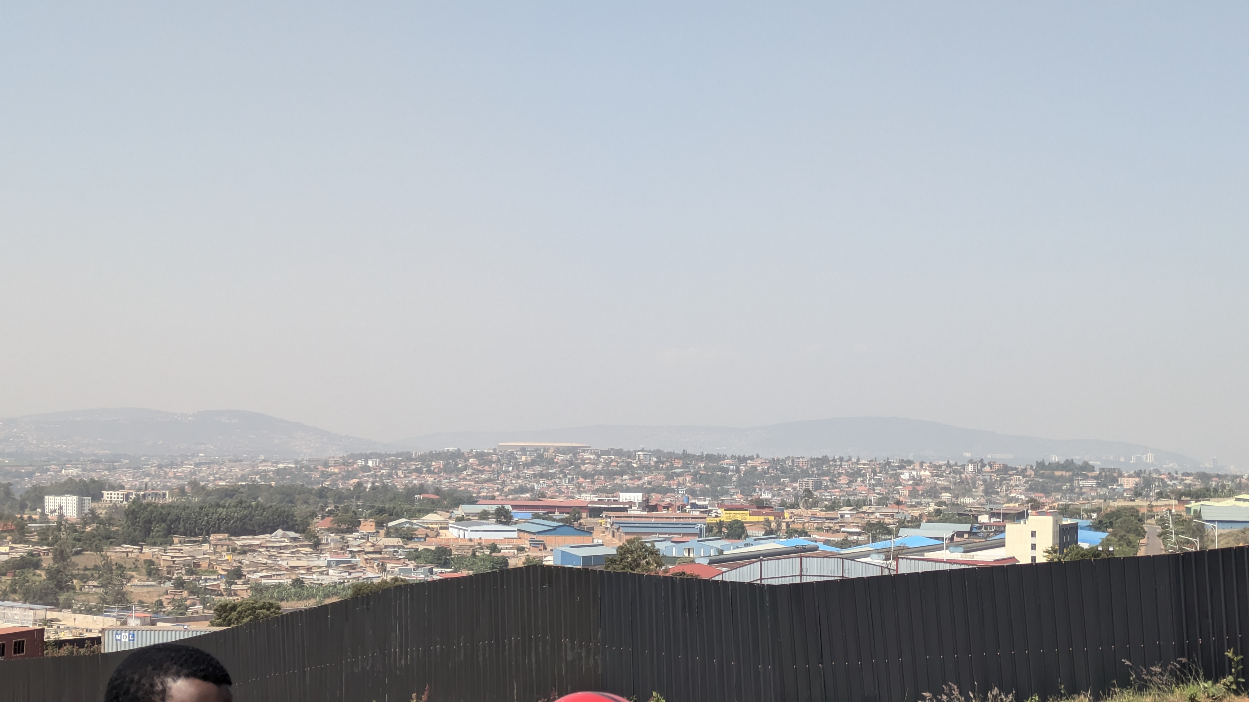
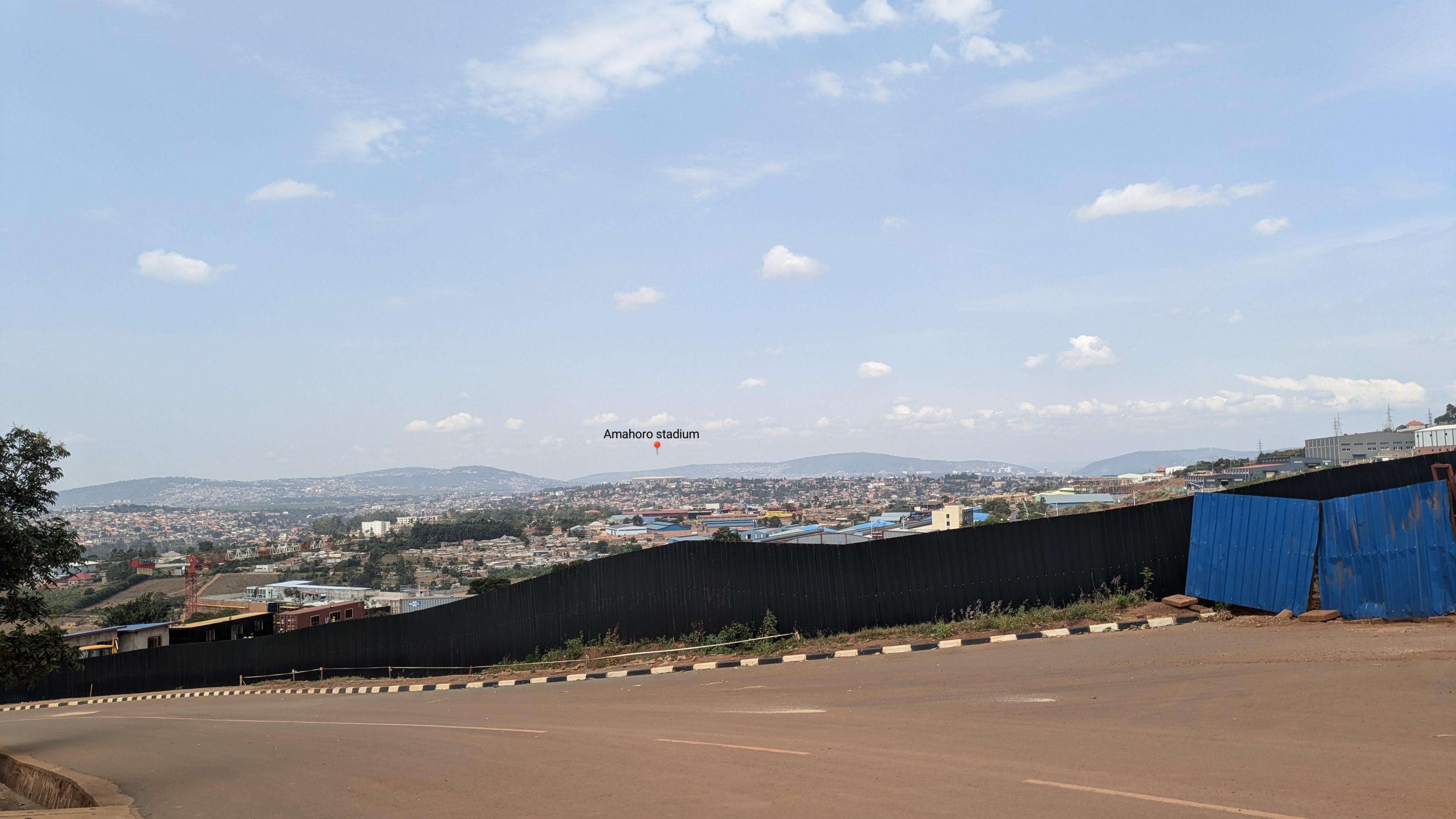
The images in this visual comparison were captured on two different days: February 26th and March 7th. In one, the Amahoro Stadium and background hills stand out clearly, while in the other, visibility is noticeably lower. The Amahoro Stadium, annotated below, served as a consistent landmark to align the images as closely as possible. Both photos were taken from the CMU-Africa campus.
Image Comparison
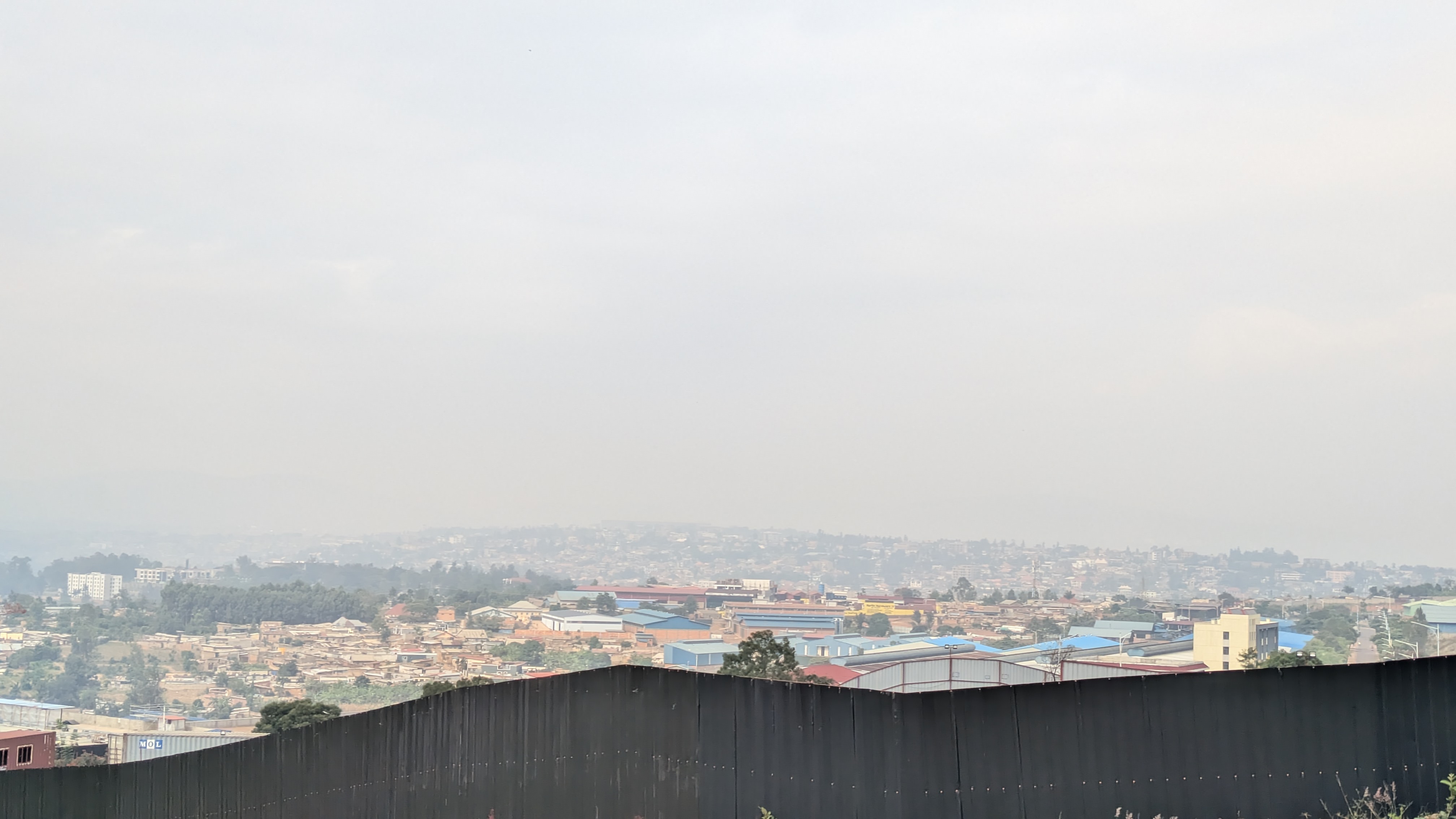
When interpreting these images, it’s important to carefully distinguish between reduced visibility caused by particulate matter (PM) and that due to natural factors like fog or water vapor, as shown in the image below. Captured early in the morning—a time when fog is common in Kigali—this photo reveals how our reference point, the Amahoro Stadium, becomes completely obscured by fog, highlighting the challenge of isolating PM’s impact on visibility.
Data Analysis - 2024 Kigali Perspective
PM2.5 Concentration Trends (2022–2025)
| Year | Average PM2.5 (µg/m³) | Maximum PM2.5 (µg/m³) | Minimum PM2.5 (µg/m³) |
|---|---|---|---|
| 2025 (Jan-Feb) | 53.19 | 113.00 | 9.80 |
| 2024 | 34.38 | 152.30 | 3.70 |
| 2023 | 42.48 | 150.50 | 3.20 |
| 2022 | 47.04 | 217.20 | 3.60 |
Note: 2025 data covers January–February only. Total readings for 2022: 5,640 measurements.
Data Quality and Coverage
- Total valid readings: 2,647 (after filtering out negative values)
- Consistent hourly measurements with approximately 110 readings per hour
- Standard deviation of 17.04 µg/m³ indicates moderate variability in measurements
Temporal Patterns
- Clear day-night variation:
- Daytime average (6AM-6PM): 31.08 µg/m³
- Nighttime average (6PM-6AM): 37.67 µg/m³
- 21.2% higher concentrations during nighttime
- Hourly patterns show peak concentrations in early morning hours (around 3-4 AM)
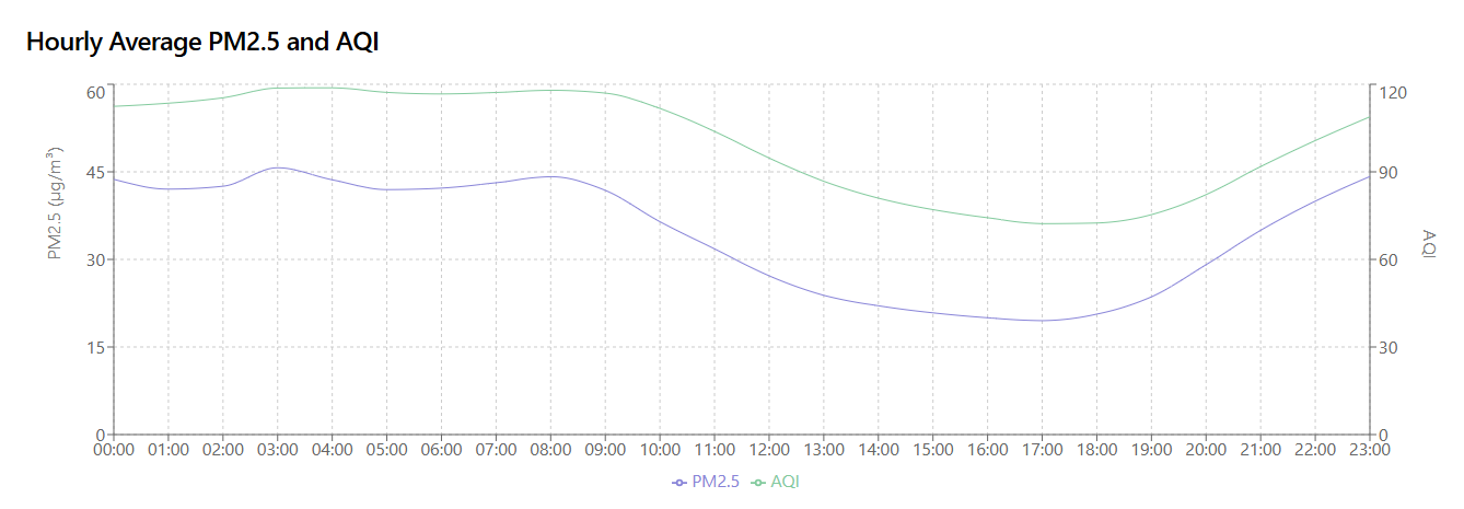
One surprising observation is that Kigali’s hourly PM2.5 averages reveal lower levels from 11 a.m. to 6 p.m. and higher concentrations at night—contrary to my initial expectations. I had assumed daytime would show elevated particulate matter due to increased human activity, such as transportation and industrial operations, as is commonly expected in urban settings.
The EPA page explains that PM2.5 (fine particles 2.5 micrometers and smaller) is emitted directly from sources like "construction sites, unpaved roads, fields, smokestacks, or fires" and forms in the atmosphere from pollutants like sulfur dioxide and nitrogen oxides, which are "emitted from power plants, industries, and automobiles." These sources are tied to daytime human activities, especially transportation (vehicle exhaust) and industrial operations (smokestacks, power generation) For more on how human activities contribute to PM2.5, see the
EPA’s Particulate Matter Basics.Distribution Characteristics
- Mean PM2.5: 34.38 µg/m³
- Maximum recorded value: 152.30 µg/m³
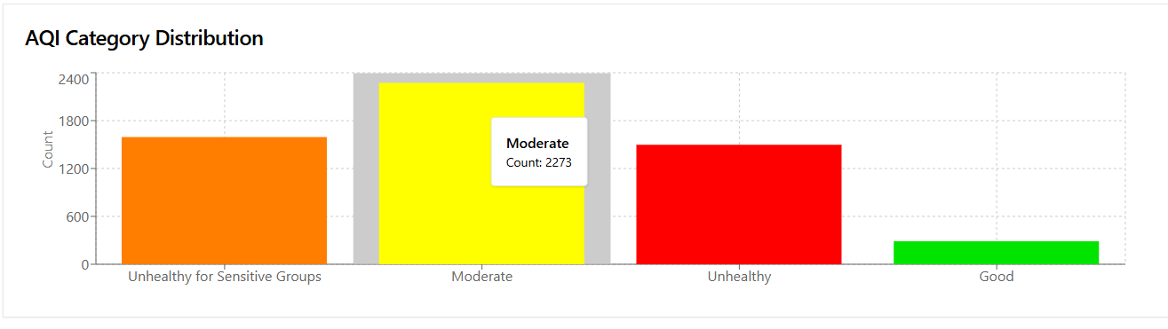
- AQI Category breakdown:
- Moderate: 57.5% of readings
- Unhealthy for Sensitive Groups: 31.2%
- Unhealthy: 10.3%
- Good: 0.9%
Air Quality Perspective
Overall Air Quality Status
- The average PM2.5 concentration of 34.38 µg/m³ exceeds WHO guidelines (annual guideline of 5 µg/m³)
- Only 0.9% of readings fall in the "Good" category, indicating persistent air quality challenges
- Over 41% of readings (Unhealthy + Unhealthy for Sensitive Groups) indicate significant health risks
Health Implications
- The high proportion of "Unhealthy for Sensitive Groups" (31.2%) suggests regular risks for:
- People with respiratory conditions
- Elderly individuals
- Children and pregnant women
- 10.3% of readings in "Unhealthy" category indicate periods where general population may experience health effects
Overall Statistics (2022–2025)
This section presents the combined PM2.5 concentration statistics for Kigali, Rwanda, from 2022 to 2025 (with 2025 data covering January–February only). The data, collected from the US Embassy’s reference monitors, provides a comprehensive view of air quality over this period, totaling 14,690 measurements. Below are the key concentration metrics and the distribution of readings across Air Quality Index (AQI) categories, offering insights into the city’s long-term air quality trends and associated health implications.
Concentration Metrics
| Metric | Value |
|---|---|
| Average PM2.5 (µg/m³) | 43.31 |
| Maximum PM2.5 (µg/m³) | 217.20 |
| Minimum PM2.5 (µg/m³) | 3.20 |
| Total Readings | 14,690 |
Air Quality Categories
- Good: 495 readings (3.4%) – Air quality poses little to no risk.
- Moderate: 5,781 readings (39.4%) – Acceptable air quality, but some pollutants may affect sensitive individuals.
- Unhealthy for Sensitive Groups: 4,464 readings (30.4%) – Increased risk for sensitive populations, such as those with respiratory issues.
- Unhealthy: 3,950 readings (26.9%) – General population may experience health effects; sensitive groups face greater risks.
Over the 2022–2025 period, the average PM2.5 concentration of 43.31 µg/m³ significantly exceeds the WHO annual guideline of 5 µg/m³, indicating persistent air quality challenges. Notably, only 3.4% of readings fall in the "Good" category, while over 57% are classified as "Unhealthy" or "Unhealthy for Sensitive Groups," underscoring significant public health concerns across multiple years.
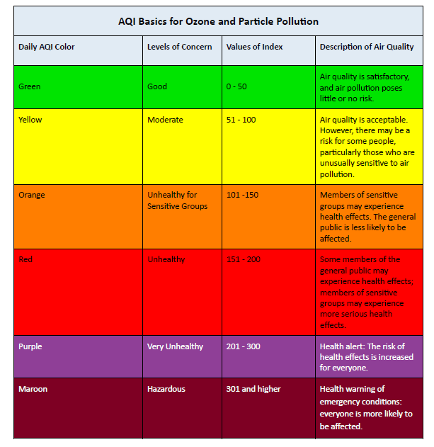
This chart gives an explanation of what the Air Quality Index (AQI) readings mean. If not familiar with the AQI find more information here: Understanding the Air Quality Index
Data sourced from Airnow.gov, provided by the U.S. Environmental Protection Agency and the U.S. State Department’s air quality monitoring program. Data provided on as-is basis and does not verify the accuracy.